Uniforms, kits, jerseys or whatever you may call them, are a defining piece of a sports team. They can be the best thing about a team, the worst thing about a team or, as in the cases I’ll discuss, the absolute weirdest thing about a team. With so many to choose from, it’s hard to truly represent all of the ridiculousness that has occurred on professional sports uniforms throughout the last century; nonetheless, here are just a few of the oddest uniforms in sports history:
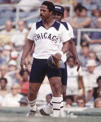
1976 Chicago White Sox Shorts Uniform. On August 8th, 1976, the Chicago White Sox debuted the first shorts uniform in baseball history in the first game of a doubleheader. The White Sox players changed right back into regular baseball pants before the second game of the doubleheader thus ending the short-lived career of the short pant in baseball. I can’t say I blame them.
1978 San Diego Padres Brown Road Uniform. The Padres have not had the greatest of uniforms in their team’s history which, to their credit, isn’t a huge surprise as brown and yellow are the team’s primary colors. This particular uniform was especially unusual. With yellow pants and socks both with brown piping, a mostly brown jersey top with yellow sleeves and a yellow v-neck collar, and a brown and yellow hat to top it off, the Padres certainly had a unique look going.
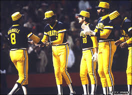
Pittsburgh Pirates Uniforms from 1977-1979. The Pirates, like the Padres, also went through some weird times in the late 1970’s in regards to their uniform selection. Ranging from pinstripes to all yellow to all black and every combination in between, the Pirates rolled out a number of different uniforms that were all quite ridiculous. The defining feature of course was the Pirates hat; whether yellow with black stripes or black with yellow stripes, these Pirates hats were perhaps the worst in baseball history.
Travel Journalism & Photography Internship Seminars in Madrid, Spain
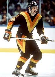
Early 1980’s Vancouver Canucks Jerseys. The Canucks throwback 1980’s jerseys were some of the most unusual and ridiculous jerseys in NHL history. A mosh of black, orange, and yellow in an odd V-formation (for Vancouver) on the chest highlighted these audacious uniforms.
1933 Pittsburgh Steelers Throwback Uniforms. These uniforms were actually worn again by the Steelers fairly recently and received a ton of media attention, and rightfully so. The combination of black and yellow stripes on the jersey shirt and the socks, but not the pants, along with the white number boxes made for quite an unusual sight.
2012 Golden State Warriors Sleeved Uniforms. Basketball uniforms have always been sleeveless so when the Warriors and Adidas announced this new sleeved jersey, it threw the basketball world into a bit of a frenzy. Not only did the sleeves look awkward, but the pinstripe shorts didn’t really help to make the uniform look “normal,” if anything they did the opposite.
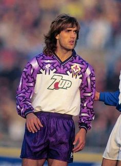
1992 Fiorentina White/Purple Kit. Italian club Fiorentina presented Serie A with an odd and controversial kit in the 92/93 season. The shirt was a base white with purple shoulders and sleeves that had a very weird design. Many people thought the patterns on the jersey resembled swastikas and, while the designers insisted they had an “optical effect,” they did not go over well. The 7up sponsorship only made the kit that much weirder, a seemingly unusual sponsor for an Italian club.
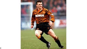
1993 Hull City Orange Kit. There’s really not much that needs to be said with these ridiculous uniforms, although tiger enthusiasts might argue that they’re quite brilliant.
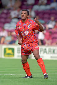
1994 Scunthorpe United Away Kit. Personally, I love these uniforms. With Pleasure Island amusement park as their sponsor, Scunthorpe United seemingly attempted to translate the colorful nature of a carnival or fair into a soccer kit and it didn’t quite pan out. While certainly a classic kit, the 94 away shirt for Scunthorpe looked more like a combination of cotton candy and confetti than a soccer jersey.
A common theme among most of these ridiculous uniforms is the era in which they were made and worn. Sports uniforms seemed to be much more unique and unusual in the 70’s, 80’s and 90’s than they are in the modern sports world today. With the popularity of style and fashion in the world today, teams seem to make more conservative approaches to selecting unique or ridiculous uniforms. Teams that look sharp are often more popular and have the potential to make more profit through jersey and apparel sales; this creates even more benefits for a team, enabling them to purchase more expensive players, upgrade facilities and hire more experienced staff. Fortunately for fans, there are some teams still out there who put forth ridiculous uniforms that make sports a bit more interesting.
While many teams are following the trend and putting out more stylish and sharper-looking uniforms and kits, Club Deportivo Lugo (CD Lugo) have gone in perhaps the reverse direction. Although they aren’t quite in the spotlight of soccer (3rd tier of Spanish soccer), they’ve certainly made a name for themselves with the outlandish nature of their kits. CD Lugo’s first three uniforms for the 2014/2015 season are rather standard but they introduced a fourth and fifth kit that caused shock waves through the soccer world. Their fourth uniform is designed to look like a pint of Esterella Galicia beer, their sponsor, while the fifth uniform seems to display an octopus or octopus tentacle on the front of the shirt. With these, CD Lugo has given fans two unique and intriguing uniforms that have not only been a hit with their own fans, but have generated buzz from interested fans all over the world.
I will admit that there is something wonderful about seeing a team looking sharp in a great, stylish uniform. It’s something else entirely, though, to see a team trot out in a weird throwback uniform and play, all the time looking absolutely ridiculous. It’s great for sports and fans love it, so why don’t we see more of it?
Crazy, right? Leave your thoughts in the comments below!

